Address
Caochang Industrial Area, Liguang Rd, Lishui, Nanhai, Foshan, Guangdong, China
Phone:
0086-20-8938 9313
0086-757-8938 9313
Email:
Work Hours
Monday to Friday: 8AM - 10PM
24x7 online service

Address
Caochang Industrial Area, Liguang Rd, Lishui, Nanhai, Foshan, Guangdong, China
Phone:
0086-20-8938 9313
0086-757-8938 9313
Email:
Work Hours
Monday to Friday: 8AM - 10PM
24x7 online service
Custom LED Light Box & SEG Display Manufacturer
Approve trade show print color with a physical proof on the intended material, viewed in agreed lighting and tied to one artwork revision. Retain the accepted result so repeat orders can be compared against the same reference.
This guide helps brand teams and exhibition buyers decide how printed color will be accepted across a campaign. It covers the target, proof conditions and correction record. Finished-size templates, frame fit and print-file preflight still need their own checks; approving color does not approve those other parts of the graphic.
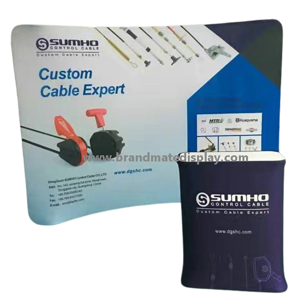
The photograph shows a printed backwall and counter in an exhibition application. Explore the BrandMate Backdrop Display family for the pictured backwall. A photograph helps discuss the application and artwork layout; it does not prove a color match or a completed proofing test.
Nominate one controlling color reference and the person authorized to approve it. Identify which colors are critical: a principal logo color may need closer attention than a photographic background or a large gradient. If an approved physical master exists, identify it clearly and check that it remains usable. A reference code helps communicate a target; it does not establish how every printed material will appear.
| Decision | Agree before proofing | Evidence to retain | If it is unresolved |
|---|---|---|---|
| Color target | Buyer-approved physical master or documented reference, its identity and condition, and the critical colors to prioritize. | Reference identifier, supplied physical sample where applicable and named artwork/color approver. | Clarify which reference controls; do not treat several inconsistent files or photographs as one accepted target. |
| Material and finish | Actual substrate, print side, proposed process and finish for each graphic. | Material/sample reference and the production information confirmed for the quoted proof. | Request a proof on the intended material before accepting its finished appearance. |
| Viewing condition | Agreed comparison light and the intended display state; treat unlit and backlit approval separately where both are required. | Lighting/location notes, sample orientation and identified display configuration if illuminated. | Review the relevant physical sample in the required condition before releasing that use. |
| Acceptance method | Visual comparison criteria, authorized approver and any separately agreed instrumental method and threshold. | Signed decision, observed differences and measurement report if that method was agreed and performed. | Resolve the method or permitted variation before judging the proof; an undefined percentage is not a usable threshold. |
List each combination that needs approval: for example, an unlit textile backwall and a printed counter face may use different materials or finishes. Give each its own accepted physical proof. Where the campaign includes a backlit graphic, add the illuminated state required for that product. Do not transfer an acceptance from paper to fabric, or from an unlit sample to a lit installation, without reviewing the relevant result.
Ask BrandMate to confirm the proof route and the scope available for the actual order. Agree what can be evaluated with a swatch, what needs a representative printed area and what needs the graphic fitted to the offered display. These are project approval requirements, not a claim that a particular laboratory method or matching tolerance is included as standard.
Supply the current editable master and the agreed print-ready export. Identify critical colors, their source references and the approved artwork revision. If files contain conflicting color values, untagged images or multiple logo versions, resolve which one is intended before proofing. Ask the print provider which production file format and color workflow apply; keep that agreed export rather than changing conversion settings between samples.
Confirm the intended substrate, print side, surface finish and print process for the proof. Record the material and any batch information available for traceability. A smooth rigid panel, textured textile and translucent print can present the same artwork differently. A proof made on a convenient alternative material may help with composition, but needs a separate review before it can control the final material’s color acceptance.
Use a representative proof area containing the critical solid colors and any demanding details in the actual design, such as dark neutral areas, gradients or small reversed text. Identify its scale and position in the finished graphic. If scale, seams or tension affect the intended appearance, agree a larger or fitted proof for those checks. A small flat swatch cannot establish uniformity across an entire finished display.
Keep a versioned record of what changed between proofs. When a sample is rejected, ask which variable will be adjusted and whether the next proof uses the same material and process. Changing the file, substrate and finish together makes the reason for a different result harder to identify. Review the proposed correction with the print provider and keep the rejected proof for comparison.
Place the target and candidate sample side by side in the agreed comparison area, with a consistent orientation and surrounding background. Avoid judging one sample in a bright window and another under a different lamp. Record the lighting arrangement or location used, who made the decision and which printed side was compared. Keep the condition repeatable enough for the next proof or receiving check.
Inspect critical solid areas first, then neutrals, gradients and detail. Compare at the agreed viewing distance and angles relevant to the display, keeping reflections in mind on glossy finishes. Note the difference by area and appearance rather than writing only “wrong color.” For example, record whether a critical area appears warmer, darker or uneven under the stated light. Such observations locate the issue; they are not a measured color-difference value.
If the product must be accepted in more than one lighting condition, inspect and record each required condition. A pair that appears close under one light may separate under another; ask the print provider to review that result with the material and workflow. Agree which viewing condition governs acceptance and whether any other required condition also needs correction.
For backlit use, compare the representative sample in the identified display configuration and intended illuminated state, following the equipment’s instructions. Keep the relevant lighting setup and viewing conditions identified; do not modify electrical equipment to create a proofing test. If both lit and unlit appearance matter, record two decisions. A phone photograph can locate a defect or document setup, but camera exposure, white balance and the viewing screen make it unsuitable as the sole exact-color approval reference.
Separate a consistent overall color shift from uneven printing or a difference that appears only in a particular display state. Compare the proof labels, artwork export, material and recorded lighting first. This prevents a file-version mix-up or a changed viewing condition from being treated as an ink adjustment.
If a critical solid color differs uniformly from its target, ask the print provider to review the identified color, file conversion and offered print/material combination. Request a revised proof of that same area on the intended substrate. Compare it with both the controlling target and the retained earlier proof under the same agreed conditions. Accept the correction only when the authorized approver closes the recorded difference.
If the result changes mainly with lighting or illumination, review the reference condition and material/display state before altering the entire artwork. If the issue is patchiness, banding, edge appearance or a seam, locate it on the print and request a review of the relevant production or finishing step. A color adjustment alone does not establish that a uniformity or construction issue is resolved. Repeat the affected check on a representative corrected sample.
Where the requested target cannot be accepted on the proposed material or process, ask for the achievable proof options. The buyer can accept a specifically documented variation, choose another offered material/finish, revise the artwork or keep the item on hold. Record the choice and review its effect on the rest of the campaign; do not silently redefine the master target to make one sample pass.
For visual acceptance, name the approver, controlling reference, proof, viewing conditions and permitted differences. If instrumental acceptance is required, agree the measurement method, equipment, conditions, sampling locations, calculation and threshold with the print provider before testing. Retain the actual report and identify what was measured. No universal percentage or numerical tolerance is established by this guide.
A measurement result applies to its stated method and samples. It does not replace review of the installed appearance where that is part of the project brief. Equally, a signed visual decision is not evidence that an instrumental test was performed. Keep both records when the order requires both.
| Record | Include | Closure or repeat trigger |
|---|---|---|
| Target and proof identity | Physical master/reference, proof date, material/finish and intended viewing state. | Replace ambiguous or damaged references; agree whether a new master or reproof is needed. |
| Artwork and production version | Final export, critical colors, file revision, confirmed substrate and process information. | Reproof affected colors if artwork, conversion, material, finish or process changes. |
| Comparison conditions | Light/location, sample orientation, background and installed or illuminated configuration where applicable. | Repeat the comparison if the intended viewing condition changes or the result only passed in another state. |
| Acceptance result | Accepted / correction required / hold, named approver, observed differences and any agreed measurement result. | Record the corrected variable, new proof and repeated check before closing a failed item. |
| Retained reference and reorder | Accepted physical proof storage location, matching digital files and the reference used for the next batch. | Review an aged, lost or altered reference before using it to accept a reorder. |
Store the accepted physical proof with a label that connects it to the artwork and material references, while protecting its printed surface according to the material’s care guidance. Keep the accepted digital export and approval record where the buyer and print team can retrieve them. Photographs are useful supporting records; retain the physical proof when physical appearance is the acceptance basis.
At reorder, identify the retained master and the previously accepted substrate-specific proof. Ask whether the artwork, material, finish, print process or intended viewing state has changed. Record available production and material references for the new batch. Even when the digital file is unchanged, a relevant material or workflow change should trigger review of the affected colors.
Agree the first-piece or representative batch comparison and inspection scope for the order. Compare new output with the accepted proof under the recorded conditions; label any mismatch by batch and location. If it fails, hold the affected release, review the changed variables and repeat the agreed proof check after correction. An accepted proof does not inspect every graphic in a shipment.
Check the retained reference before relying on it. Damage, fading, staining, unknown storage or a missing identity can make an old sample an uncertain master. Agree whether to establish a new reference or reproof from the documented target. Keep the change history instead of accepting a new batch against an unrecorded photograph of the previous event.
For multi-material campaigns, keep the separate accepted proofs together as a set. Compare the new fabric against its fabric proof and the new rigid print against its own proof, then review the required combined appearance. This preserves a common design direction while keeping each material’s actual acceptance decision clear.
Share the artwork revision, controlling color reference and critical colors, intended materials/finishes, display state and viewing conditions. State who approves color and whether visual or instrumental acceptance is required. Add the print quantities, destination and project date, then ask BrandMate to confirm the available proof route, costs and timing for that order. Detailed files and physical samples can follow the initial discussion.
Use it to check content and composition. For physical-color acceptance, agree the relevant printed proof, material and viewing conditions; a screen image alone does not establish that result.
One target can guide the campaign, but retain an accepted proof for each required material/finish and display state. Review the combined appearance where the pieces will be seen together.
Keep the accepted proof and version records, identify changes and agree checks for the new batch. New output still needs the acceptance scope agreed for that order.
Explore the BrandMate Backdrop Display family and discuss the printed materials and physical references required for your project.
Tell BrandMate which printed display you need and which colors matter most. Share the artwork and physical-reference details during the project discussion.